component_options.hpp File Reference
 This graph shows which files directly or indirectly include this file:
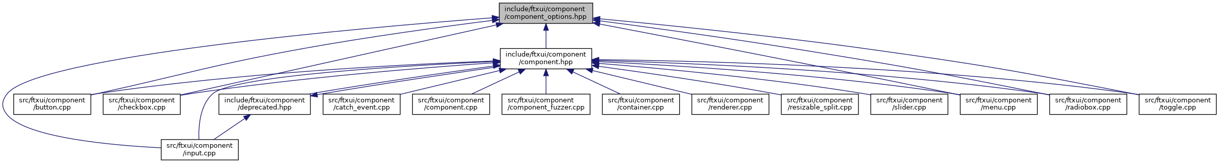
Go to the source code of this file.
Data Structures | |
| struct | MenuOption |
| Option for the Menu component. More... | |
| struct | MenuEntryOption |
| Option for the MenuEntry component. More... | |
| struct | ButtonOption |
| Option for the Button component. More... | |
| struct | CheckboxOption |
| Option for the Checkbox component. More... | |
| struct | InputOption |
| Option for the Input component. More... | |
| struct | RadioboxOption |
| Option for the Radiobox component. More... | |
| struct | ToggleOption |
| Option for the Toggle component. More... | |
Namespaces | |
| ftxui | |
Data Structure Documentation
◆ ftxui::MenuOption
| struct ftxui::MenuOption |
Option for the Menu component.
- Examples
- examples/component/menu.cpp, examples/component/menu2.cpp, and examples/component/menu_style.cpp.
Definition at line 11 of file component_options.hpp.
| Data Fields | ||
|---|---|---|
| Decorator | style_normal | style. |
| Decorator | style_focused | Style when focused. |
| Decorator | style_selected | Style when selected. |
| Decorator | style_selected_focused | Style when selected and focused. |
| function< void()> | on_change | Called when the selected entry changes. |
| function< void()> | on_enter | Called when the user presses enter. |
| Ref< int > | focused_entry | |
◆ ftxui::MenuEntryOption
| struct ftxui::MenuEntryOption |
Option for the MenuEntry component.
- Examples
- examples/component/menu_entries.cpp.
Definition at line 28 of file component_options.hpp.
| Data Fields | ||
|---|---|---|
| Decorator | style_normal | style. |
| Decorator | style_focused | Style when focused. |
| Decorator | style_selected | Style when selected. |
| Decorator | style_selected_focused | Style when selected and focused. |
◆ ftxui::ButtonOption
| struct ftxui::ButtonOption |
Option for the Button component.
Definition at line 38 of file component_options.hpp.
| Data Fields | ||
|---|---|---|
| bool | border | Whether to show a border around the button. |
◆ ftxui::CheckboxOption
| struct ftxui::CheckboxOption |
Option for the Checkbox component.
Definition at line 45 of file component_options.hpp.
| Data Fields | ||
|---|---|---|
| string | style_checked | Prefix for a "checked" state. |
| string | style_unchecked | Prefix for a "unchecked" state. |
| Decorator | style_normal | style. |
| Decorator | style_focused | Style when focused. |
| Decorator | style_selected | Style when selected. |
| Decorator | style_selected_focused | Style when selected and focused. |
| function< void()> | on_change | Called when the user change the state. |
◆ ftxui::InputOption
| struct ftxui::InputOption |
Option for the Input component.
Definition at line 60 of file component_options.hpp.
| Data Fields | ||
|---|---|---|
| function< void()> | on_change | Called when the content changes. |
| function< void()> | on_enter | Called when the user presses enter. |
| Ref< bool > | password | Obscure the input content using '*'. |
| Ref< int > | cursor_position |
When set different from -1, this attributes is used to store the cursor position. |
◆ ftxui::RadioboxOption
| struct ftxui::RadioboxOption |
Option for the Radiobox component.
Definition at line 76 of file component_options.hpp.
| Data Fields | ||
|---|---|---|
| string | style_checked | Prefix for a "checked" state. |
| string | style_unchecked | Prefix for a "unchecked" state. |
| Decorator | style_normal | style. |
| Decorator | style_focused | Style when focused. |
| Decorator | style_selected | Style when selected. |
| Decorator | style_selected_focused | Style when selected and focused. |
| function< void()> | on_change | Called when the selected entry changes. |
| Ref< int > | focused_entry | |
◆ ftxui::ToggleOption
| struct ftxui::ToggleOption |
Option for the Toggle component.
Definition at line 93 of file component_options.hpp.
| Data Fields | ||
|---|---|---|
| Decorator | style_normal | style. |
| Decorator | style_focused | Style when focused. |
| Decorator | style_selected | Style when selected. |
| Decorator | style_selected_focused | Style when selected and focused. |
| function< void()> | on_change | Called when the selected entry changes. |
| function< void()> | on_enter | Called when the user presses enter. |
| Ref< int > | focused_entry | |